Blog
We Changed Our Name. Then Our Favicon Got Awkward.
The EZOnline migration was done. Then I noticed a familiar-looking favicon. A small, self-deprecating detour back to the drawing board.
ALTools had just moved to EZOnline. I thought I might finally be done with rebranding for a while.
New name. New domain. Tools moved over. Redirects working. Time to get back to the product.
Then I noticed that the new favicon looked a little like the current one on estsoft.ai.
Oh. You again?
The domain was one thing. Now the icon too?
When I bought altools.ai, I was thinking about “Alternative AI Tools.” I wasn't expecting that domain to lead to a dispute involving ESTsoft. That became a long story, which I've written about separately.
The favicon for EZOnline was supposed to be a much smaller job. Keep it simple, give it a little technology feel, make sure it survives being shrunk. I ended up with a blue rounded square and a white geometric shape that suggested an E.
I liked it. It looked quite at home on the website.
Then I noticed the current estsoft.ai icon.
Viewed separately, they were different designs. Shrunk to browser-tab size, though: blue square, white geometry, a hint of E. To my eyes, they had a somewhat similar feel.
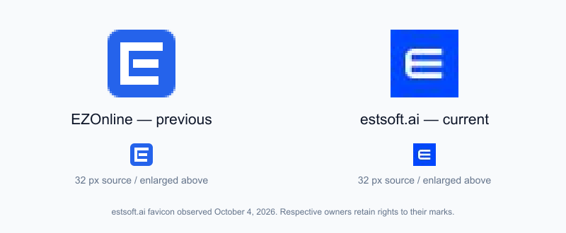
Left: the previous EZOnline icon. Right: the favicon observed on the official estsoft.ai website on October 4, 2026. Enlarged above, shown at 32px below. Rights to each mark remain with its respective owner.
I couldn't help wondering: do ESTsoft and I have the sort of connection you wish would stop reconnecting?
First the domain. Then, after changing the name, even drawing a tiny icon managed to bring up another familiar-looking encounter.
If this is a connection, I'd quite like to disconnect.
Of course, blue backgrounds and white letters are common. This is just my impression of the resemblance. What made me laugh was the timing. After all that migration work, this was the little thing sending me back to the drawing board.
The entire website had moved house. Sixteen pixels were still having trouble with the packing.
Fine. Let's change it again
Once I noticed it, it rubbed me the wrong way. So I changed it.
This time I stopped adjusting the blue-square-white-E recipe and tried a different direction. Along the way, there was a more literal Z. Beside “EZOnline” in the header, it felt like an extra initial had joined the name.
Back to the drawing board again.
The selected version has two shapes, blue and teal, with a folded gap between them. Together they suggest a rounded square. There are hints of E and Z without having to spell them out across the icon's face.

This one feels more like a complete symbol to me. It works with light and dark backgrounds, and I like it better.
The old version stays in the archive. It was there for the first stage of the rename. That stage just turned out to be a little shorter than expected.
Let's leave it there for now
I used to think migration was DNS, 301 redirects, canonical URLs, and sitemaps. Apparently, it also includes these small, slightly ridiculous moments when you look at a browser tab and wonder how you got here again.
The serious part was serious enough. This is just a small outtake, at the expense of my own branding luck.
The name is settled. The icon is picked.
I'd like to get back to making tools now.
Hopefully, this time I can.
The full migration story: Why ALTools Became EZOnline.